What I’m Thankful For . . .

Assignment: We have to post on what we are thankful for this time of year.

I am really not sure what to write about for this post. For me, this topic is kind of personal. Honestly, there are many things that I am thankful for, many things are over stuff that anyone would be thankful for. So I guess I will just talk about things that I am thankful for that first come to mind.

I am thankful for my wonderful, supporting family. I am also thankful for my super sweet cat, Tiger, who seems to always cheer me up when I am down. I am grateful that I was able to go to the college of my choice, and that I have nearly made it successfully through my first semester of my second year in college. I am also thankful for my amazing friends and my amazing roommate. Lastly I am thankful for how a family friend is doing well after going through tragic events. Honestly I feel that I am thankful for everything that has happened in my life.

. . . This was an interesting class and I learned some new things too. I really wasn’t sure what I would do in this class but it was interesting. Some of the assignments were a little challenging, but I don’t believe that I particularly disliked any of the assignments. In fact, the exercises helped my creative thinking, I really thought that the group work was helpful because it helped me come up with more ideas. I honestly felt that the exercise that gave short time periods also helped spur creativity and also gave an idea of deadlines. I think the assignments helped strengthen my skills. I also enjoyed the stop motion video project, it is fun seeing what peoples’ brains come up with at the spur of the moment.

Good and Bad Examples of Sign Design

Assignment: My assignment for class was to go out and walk around town, taking pictures of signs. We then have to decide what signs have good and bad examples of type.

SANYO DIGITAL CAMERA

1. This sign is decent, I think the simplicity of the text is fine, but the colors chosen for the text blends in to the dark background.

SANYO DIGITAL CAMERA

2. This sign has a clean appearance. The type is simple enough to read but is still stylish.

SANYO DIGITAL CAMERA

3. This sign, I think the swooping curves in the text cause the text to blend slightly together.

SANYO DIGITAL CAMERA

4. This sign has a nice appearance, but the capital letters can be confusing to read and the spacing can make the words appear to run together.

SANYO DIGITAL CAMERA

5. I like the design of the text in this sign, but I feel that the color chosen, as well as the use of shadows behind the text, makes the text appear to double.

SANYO DIGITAL CAMERA

6. This sign has very simple text, but the way it is placed and used, seems to work.

SANYO DIGITAL CAMERA

7. This sign’s type is interesting and creates an old style feeling, but I do not like how the words “stuff” and “more” overlap.

SANYO DIGITAL CAMERA

8. This sign’s type works with its theme and is easy to read.

SANYO DIGITAL CAMERA

9. I like the artistic style of the type used and it seems to work with the rest of the artwork in the sign, but the first three letters could blur together.

SANYO DIGITAL CAMERA

10.  The type of this sign, has the same flowing feel as the rest of the sign’s design and it is easy to read.

SANYO DIGITAL CAMERA

11. The type of this sign is way to small to be able to see at a distance, there seems to be to much crammed in such a small space.

SANYO DIGITAL CAMERA

12. This sign’s text has great design and the color makes it pop.

SANYO DIGITAL CAMERA

13. I like the bold design of the text in this design, it stands out at a great distance.

SANYO DIGITAL CAMERA

14. This simple type is works well, but the chosen color used, makes the words harder to depict when at a distance.

SANYO DIGITAL CAMERA

15. I like the simple, clean design of the text in this sign. The color usage is even great.

16. The type is simple, but the boldness works with this sign.

SANYO DIGITAL CAMERA

17. The type needs improvement because it begins to blend into the border surrounding it.

SANYO DIGITAL CAMERA

18. I like the creative appearance of this sign, and the use of color pops out of the rest of the design. The smaller words do blur at a distance though.

SANYO DIGITAL CAMERA

19. For this sign, the type is a little strange to me, the color is also a little strange.

SANYO DIGITAL CAMERA

20. This sign’s simple artsy type works, and the white pops against the red.

This assignment made me more aware of the designs of signs. The bad thing, was that I froze while I looked for these signs, it was very cold outside.

Betrayal . . . Our Stop Motion Video

So . . . the idea that my friend, Natalie, and I  came up with for the stop-motion video got changed up a bit. We decided not to use carrots in our video and instead used pears. The storyline also got changed up. It went from a tragedy, to a happy romance, and finally, to the bitter sweet betrayal of Marie and Francisco, the French pears.

Tragedy was our first idea, we originally wanted a Romeo and Juliet like feel to our video that would have one of the carrots dying and the other ending its life to ensure it could stay with its one true love for all of eternity. When we could not find decent carrots, we changed the characters into pears, and decided to go with Natalie’s idea to create a cutesy romance story, no death and sadness. that soon changed in the process though. We decided that one of the pears, Francisco, would be killed through death by garbage disposal. Yeah, our story grew quite dark and disturbing.

The making of the video was tedious. I hated having to take numerous pictures, and then after figuring out that we messed up somewhere. Occasionally, we would have to redo a scene because the phone was freezing up or the movement was too fast. But in all, I think Natalie and I did good for our first stop-motion video.

The song that we decided to use, was “Danse Macabre” from the anime, Kuroshitsuji. We chose this song, because it was fast paced and waltz-like to fit the theme of dancing pears, as well as it being somewhat creepy.

By the way, when you garbage disposal pears, you will be smelling the sweet fruity sent for the next hour. My roommate loved the aroma as well as the use of the garbage disposal . . .

“Putting it together, we used the program Monkeyjam to put all the images together into a movie. This program is specifically designed for 2-D or stop-motion animation. So, it made the process simpler than just using a video editing program. Although I had to take the video created in Monkeyjam over to a video editing program to add the music and the type, the use of AVS video editing software was simple to use due to my past experience with it when I made random videos a lot. Ignore the watermark put on the video, because I was not going to pay for it for this one project. If you want to know more, read the description at the bottom of the video.” This is what Natalie had to say for the stop-motion video.

Thoughts Over Senior Show

Tuesday night, we were assigned to go check out this semester’s senior show and blog about it. There were three different shows focusing on interesting topics. The shows were over social media, hunting, and Asperger’s syndrom. Each show had their own strengths and weaknesses.

The show over Asperger’s syndrom, provided me with a lot of good insight. The interesting facts gave me a view into the world of those with Aspergers. The graphics were good and showed me a view of how their lives are different from others and how people judge them. one of my favorites, was a poster spelling “obsessed” in a bunch of Star Wars related words. One of the biggest impacts I had, was a work that had footprints overlapping each other, showing how individuals with Aspergers react to their surroundings. The only big problem that I saw with it, was that it was hard for me to read the information provided since the text was to light of a color.

The show over hunting had a great use of color. The bright, vivid colors and placements used on a black background brings out the image designs. The images drew the viewer in, especially the picture of the black dog, which had a nice usage of light against the dogs black fur. The problem with this work, was that it felt as if it did not have enough information to understand the connection between psychological effects and hunting.

For the social media presentation, I liked the use of the soft blues and the cleanliness of the work. The presentation had an interesting view into how social media affects, and can even worsen, every day life by distracting individuals. I liked the rendering of the “Pintrest Girl” because it had good uses of design, I also liked it because it held a pretty and delicate appearance. Its problem was that it did not have enough information to understand what the show was about unless the presenter was there.

If you want to see some pictures, go here:

Senior Show

Stop-Motion Video Idea

Assignment: Last week we were assigned to split up into groups of two and create a 15 second stop-motion video within the next two weeks.

Video Idea: After much contemplating, Natalie and I decided to create a silly and tragic stop-motion video. Our video will be about one of us preparing carrot soup and when we left the cutting board, the two carrots spring to life. One carrot will be wearing a bow tie, while the other will have a bow placed on her head. Together, the two carrots begin to dance a graceful dance. At the end of the video, the girl carrot will have a tragic demise and the man carrot will end his life in order to be with his love. then one of us will return discovering that the carrots are missing.

The song that we will use is Tchaihovshy’s “The Nutcracker, II March.”

CAM00025-1

Sketches

Exercise: Book Ads — Positive, Negative, & Metaphorical

Exercise: Tuesday’s in-class exercise was to choose one random, everyday object that we found we carried on us. From that object, we would then create three sketches of ads: the first would be positive, the second would be negative, and the third would be metaphorical.

I chose a book, since I always have a book with me so I can kill time. So I began to think of positive, negative, and metaphorical ideas for books.

Positive: kills time, increases intelligence, stress reliever

Negative: distracting, heavy

Metaphorical: makes time fly, get lost in another world

booksketches2_web

Final Sketches: For the positive, I showed a person sitting on a bed, engulfed in a book. The negative has one girl who dropped her book and lost its page(this  has happened to me so many times) while another person has a Kindle. This shows that they won’t have to worry about losing their spot. The metaphorical,  would be a book pulling them into another world.

booksketches_web

Exercise: Build a Robot

Build a Robot

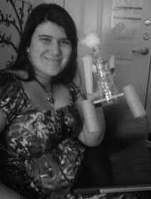
Assignment: For this assignment, we had to construct a robot out of everyday household objects. Once we have chosen the objects, we then draw out how we construct the robot. Then the directions are given to a friend to build in less than ten minutes.

Items: Exacto knife, tape, scissors, 1 water bottle, 2 toilet paper rolls, 2 note cards, 1 pencil, and 1 poof ball

Building of Robot

Building of Robot

Steps:

robotsketches_web

  • Take the plastic bottle and use Exacto knife to make holes in the bottle without damaging its shape.
  • Take the toilet paper rolls and measure 1/3rd of the way down the tube. Cut along dashed lines and use Exacto knife to cut a whole in between the two cuts.
  • Then take the two note cards and fold at lines and tape shut.
  • Push pencil through bottom holes on bottle.
  • Cut the note card box on dotted lines to create a tab and fold outward.
  • Push tabs of the note card box into top holes on bottle. This creates the arms.
  • Stick pencil ends into the e hole on each toilet paper roll, create legs of the robot.
  • With tape, stick poof ball on lid of bottle.

My roommate seemed to have fun building it. It didn’t take her to long to build the robot. I think the only thing that was challenging for her, was to stick the note card arms into the inserts on the bottle.

Robot

Robot

Exercise: Storybook

Assignment: I had to take 30 minutes to sit in a public place and watch and listen to my environment without talking to anyone or having no access to any electronics and then jot down my experience. Then, I had to take those ideas and try to come up with a story for an audience ranging from three to seven-year-olds. I then had to take seven minutes to create a 10-12 panel storyboard. I also need to try and come up with a plot, explain the story through sketches, and try and find a moral to the story.

Notes_web

Info from my notes: The people around me were talking of the costumes that they were thinking about wearing for Halloween and favorite books.

Plot: A young boy who loves to read is sucked inside a magically book and learns to befriend its unique inhabitants.

Moral: Kindness is important and it can affect the lives of everyone around you.

Storybook_web

Story: The beginning of the story will have a sickly boy name William, who could not sleep, wandering the library of his family’s mansion. Since the boy is always sick, his only escape is reading, so whenever he can, he engulfs himself in a book. While wander the library that night, he runs across a large book that is flipped open and radiating light. As he nears, he sees words lifts off its pages, which then surround him and pull him through a portal into the book. Once he begins to adventure the world, he sees all kinds of interesting creatures; knights, dragons, fairies, giants, tiny giraffes and other animals, and flowers as tall as trees and trees as tall as a blade of grass. He then befriends a fairy named Lily and her faithful friend, a tiny giraffe named Geoffrey. As the story progresses, the fairy gets William to hide from the creatures that evoke fear in all of the inhabitants of the land. There, he saw Vlad the Vampire King, leading his servants: witches, werewolves, skeletons, ghosts, jack-o-lantern men, and vampire bats.  William asked Lily and Geoffrey why Vlad the Vampire King and his minions were feared, and she said they were terrifying everyone.  William ended up discovering that Vlad and his minions were actually really kind and only wanted to become friends with the inhabitants of the strange world.  When William explained this, Vlad and his minions befriended William, Lily, and Geoffrey, and things soon changed for the better. Before going home, William promised them that he would visit again real soon. The End.

So, this was challenging for me, I have a hard time coming up with ideas for children’s books. But it was fun anyway. The challenge is good though, and this is a good way to come up with creative ideas.

6 Panel Storyboard: Colacious – The Apple Shaped Popcorn

2013-10-29_14-01-41_803

Panel Ideas

Assignment: Today, our in class assignment was to split into two groups and create a six panel storyboard. First, we each had to choose three adjectives that had three syllables and choose our favorite adjective out of the three. Then as a group, we had to choose three of all of our favorite adjectives and rank them. From the ranking adjectives, we had to take the first syllable from the first adjective, the second syllable from the second adjective, and the third syllable from the third adjective. Then we had to combine all the syllables in order to create a new word. From that, we must then create a six panel storyboard for a motion graphics piece of a made up company.

3 Adjectives I Chose: Beautiful, Ferocious, and Simplistic.

My Favorite Adjective: Ferocious

Groups 3 Favorite Adjectives: 1. Colorful, 2. Flammable, 3. Colorful (the adjectives are ranked in order of what we chose)

Syllables: 1. col, 2. a, 3. cious

Combined Syllables: colacious

2013-10-29_14-01-48_515

Notes

From Colacious, my group decided that our company would produced apple colored and shaped popcorn. Colacious would genetically alter popcorn to produce a giant apple shaped kernel that would produce different apple flavors of popcorn. In the first panel, you see a top view of a giant apple-shaped kernel in a microwave. In the second panel, you see the apple pan down into the side view of the apple kernel. The third panel shows the skin of the apple pealing back. In the fourth, you see the apple exploding popcorn. The fifth panel shows  a popcorn explosion. The last panel shows us an apple kernel in a wrapper that says Colacious and sits atop a mountain of apple flavored popcorn.

This in-class assignment was interesting. It was also fun since we were all coming up with random ideas. The reason why we decided that Colacious would be a popcorn company, was because we decided that the word sounded like culinary and delicious. Placement for the panels was a little challenging when we were trying to figure out how we could place the brand.

Exercise: Poster design

Final Poster Design

Final Poster Design

Assignment: My assignment, was to take 60 minutes to come up with an idea for a poster incorporating: Sleep: It’s What You Need. From my sketches, I then had to draw out the poster while using text you normally don’t use. (When I use text, it is usually very fluid. I don’t like rough plain text. I’ve always been that way.)

Sketches for Poster

Sketches for Poster

Sketches: The first sketch that I came up with was of a girl who feel asleep in the middle of studding for her exam. The second was of a person sleeping. The next showed one student sleeping in class while another wasn’t. The fourth is of a kid who got an ‘A’ on a test and another kid who got an ‘F’ cause he fell asleep in the middle of the test. The last sketch, and the one that I turned into a poster, is a zombie with the words, “Don’t be a zombie! Sleep: It’s What You Need!”

Poster: When I first got this assignment, I came up with the idea to create a zombie since Halloween is a week away. I also think that zombies are good at representing people. (We are lazy and don’t really want to do anything and we don’t get enough sleep which then makes us constantly complain.) So I figured that this would be a good way to explain that we need more sleep than what we get.

I also have never drawn a zombie before, so it was a slight challenge. The coloring is also strange to me. To get the zombie coloring, I used light green, black, purple, blue, red, and white. (The white helped blend the colors and pale the zombie’s skin tone. I also inked it and thickened some lines just to give variance.